
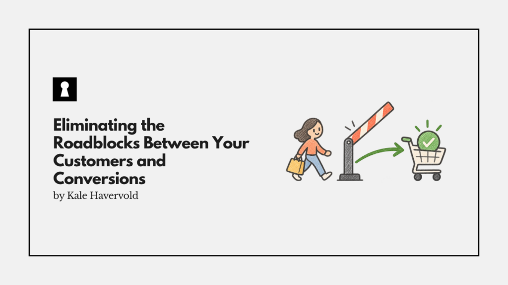
When someone visits your online store to make a purchase, they’re looking for a straightforward experience through your site and checkout. Unfortunately, many sites are full of confusing elements and points of friction that stop shoppers in their tracks, or at least slow down their journey by making things more complicated than they need to be.
These can drive customers away, cause cart abandonments, and hurt your brand’s credibility, especially if the unhappy shoppers tell their friends and family about their poor experience. This guide seeks to help you not only notice these issues, but also go over some ways to fix them and encourage more conversions.
Simplify Site Layout and Navigation
The first thing you should consider doing to reduce friction and confusion within your site or online store is to simplify your site’s navigation. If it’s cluttered with too many visual options and no white space, visitors may be overwhelmed and not know where to look for the option they’re searching for.
If you need to offer plenty of categories or pages for customers to navigate, instead of putting them all on the page at once, keep things clear by using progressive disclosure. This is all about showing only basic information or categories to start, but lets people find deeper details or advanced options if they need them.
To help people navigate your site without searching through categories manually, consider adding a powerful site search within your store. It should support advanced features like filtering, sorting, and predictive text to help customers instantly find what they’re looking for.
Be As Clear as Possible
You should also aim to make your site as clear and simple to understand as possible. You should use plain language and terms your visitors understand, and include FAQs that answer some of the most common questions you expect potential customers to have about your product, brand, or store.
Your pricing and policies should also be transparent and easy to find, your site should make it clear what you sell and/or specialize in, and you should use imagery that matches up well with your brand and what you sell.
Optimize Your Site Experience
With people having a low tolerance for slow sites and sites that struggle to load information or content, your brand should also ensure your online store is optimized. You can do this by compressing files and images, streamlining your code, using lazy loading for media below the fold, and more.
Even a small increase in performance can lead to real benefits for conversions and shopper experience, so even slight optimizations are worthwhile.
With mobile devices now being the most popular medium for online shopping, ecommerce brands also need to ensure they’re specifically optimizing their store and content for mobile.
You need to ensure buttons are large, the design is responsive, and all important buttons and options are reachable with thumbs while holding a phone to keep things comfortable for visitors. It’s also a good idea to keep the cart visible at all times, so people can check out and/or review their items without scrolling through the page to get to the cart.
Streamline the Checkout
Finally, your checkout is the last hurdle that customers need to hop over to convert, but oftentimes, it’s a point where many abandon the process. To reduce this abandonment and encourage more people to complete their purchases, you need to streamline the process.
First, you should allow for guest checkouts and not force people to create an account to buy from you. Next, make sure to offer a variety of payment methods, and you need to be especially sure to support the most common and preferred methods in your region.
To prevent last-second drop-offs, make sure there are no hidden or secret fees that you only disclose during the checkout process, as presenting unexpected costs too late is among the main reasons people are likely abandoning their carts.
Also, try to keep checkout forms short, and if they need to be longer, make sure to break them up so they’re more manageable. Lastly, consider adding a progress indicator within your checkout, so shoppers know how many steps remain before their purchase is complete.
Our Take
The Importance of Respecting Your Customer’s Time
Whether you’re simplifying your site’s layout or shortening your checkout, most of these changes boil down to being more respectful of your customer’s time. If you can’t offer a smooth experience where a customer can complete a purchase stress-free and quickly, they’ll go somewhere that does.
Removing roadblocks and barriers that stand in the way of an uncomplicated customer journey can go a long way in increasing loyalty, reducing abandonment, and driving repeat purchases.